Monday 31 January 2011

preliminary excercise

In a lesson we was given Jelly babies and a task to make a sequence making sure we used at least a match cut, a shot-reverse-shot and we had to use the 180 degree rule. This is when we to start planning our preliminary excercise with 4 jelly babies, obviously because there's only for actors. Cant lie the rest got munched!! we made a basic story line which eventually had been developed between group dicussions and contributions of ideas. We also added abit of music on there just to emphasise the suspense abit more. Even though they were just jelly babies, its the thought that counts. below is a picture.

BEHIND THE SCENES

Livetype and sound skills

In class we have recently been learning how to use the 'livetype' and 'sound'. It is essential that we familiarise ourselves with using these systems as it will be useful for when we record our real thriller opening. When i used the 'Livetype' programme i was able to choose different lettterings and fonts to make an effective title for the credits on my thriller film. The experience was good and you could choose different effects on the wording such as shuffling, blossom, fadings and all sorts. you could even choose words to make shapes which was used in other thriller films

Simultaneously, we was introduced to the programme called soundtrack pro which i was able to create some backround hip/hop-action rhythm which worked effectively well with the bagswap. I also added a few  sound effects to create emphasism of the action happening. Where we ha a short period of time to do it aswell i was surprised it even came out lyk that, pride#.

After successfully finishing off, my group then started to editing the bagswap short film then added it to the sound track pro application. It then opened on the top right corner in a small screen and we simply just put the music in synchronisation with the film.


genres and audiences..

1) How many suspense films were released in 2009? How many films were released altogether last year?

-In 2009, only 31 suspense films was released that year.
-In 2009, Altogether 503 films were released in the UK alone that year.
2) Action, animation and comedy account from 52% of Box Office in the UK in 2009. Why do you think these genres are so popular?
Personally I think that these genres are very popular mainly because of the target audience. Many young people and teenagers are the ones who mostly go cinema and they're also the ones who are mainly targeted by film distributors. The youth is also more than half of the population!
3) Why do you think Thrillers account from quite a low proportion of UK Box Office takings (4% in 2009)?
Although the thriller genre often has niche target audiences. I think the main reason this has occuredis because of the age restriction on certain thrillers. ome thrillers exclude those under 15 from watching but some thrillers also exclude those who are under 18 basically restricting most youths from watching the film but what they don't realise is that its the youths who are making them money and it's the youths who mostly use and watch these films. This is straight away restriction more than half of the population therefore highly dropping its ratings.
4) Looking at the 'genre by gender' diagram above, what information can be derived about Thriller audiences and gender?
The clear information which can be derived from simply looking at the 'genre by gender' diagram is that more males watch thriller movies than females because males like to watch more crime and action whcih are 2 of the main ingredients for a thriller movie. Woman are much more keener on watching romances, period drama and suspenseful films. The fact that some females watch suspenseful films means that some of the thriller audience are in fact females but only some whereas most of the audience for thriller films are males.
5) Look at the age certificate for 10 of the films featured on the teaching blog. What does this tell you about Thriller audiences?
These are 10 movies which i specifically picked out:


Just from looking above we can see that most of these thriller films are rated 15 and over.. This shows us that thrillers are targetting more mature teenagers and adults therefore they have a niche rather than a mass target audience. This also shows that the makers are not supporting the fact that young people may watch it because the film may include some explicit scenes which may affect someone at a young age. Because of  this in 2009, the box office in the UK only reached to 4%. Giving a small profit of just £42, 578, 104. This is because not many teenagers and adults are going to the cinema but children are. It is a fact that animation films make considerably more as in 2009 they made a enormous £159, 209, 734 in the UK box office.

title sequence which inspired me..

One title sequence that highly appealed to me was the one from the film called 'Raging Bull'. The main reason why this title sequence attracted my attention was the way that the titles actually become part of the film. By this i mean the way that they are showed on screen is as if the actor could see them whilst he's being filmed. I simply say this because of the fact that he is always in the space that the title leaves aside yet he is never exactly behind the title or overlapping it. The sequence used in this film is also known as a narrative opening as it also has all the titles running throughout right after the black shot where just the directors name is shown.

font analysis..

In the Cover of the film 'Pearl Harbour', Bold capital letters with the sans serif font make the title stand out the most out of everything. The serif is quite traditional therefore it has age to it, correspondently the film is quite old aswell therefore the font used emphasis to the audience that this is quite an old film or it is based on a historical event. We are also given a snse of army and unity as the main characters are put together and the man is wearing a uniform which symbolises a team which symbolises unity, mean while the woman is also saluting which signafies something to do with the army. There is also a fighter plane on the cover of this film therefore straight away the text and image give us the sense that the film is somehow related to war.


On the other hand Rocky uses a specific font called Franklin Gothic Heavy, which is a sans serif font. The words Rocky Big, Black, and strong in order to portay what kind of character Rocky is. The sans serif font is less formal therefore giving a sly sense of welcoming as sans serif is usually a more friendly font. If you focus on the title itself the big word rocky is very simple and doesn't fully fit into the full screen. This again is trying to show that Rocky is a very simple character but you could also say that where the name doesn't fully fit, he is 'punching his way through the poster'.

Fonts

In class we learned about the 2 different types of fonts:

Serif - on fonts such as times and courier. Serif fonts are used more traditionally and using the serif font is seen as more formal.

Sans Serif - on fonts such as Ariel and Comic sans. This use of font is highly encountered between friends as it is seen as less formal than the Serif font.

 Serif font.
                                                 Sans Serif
                                                  font. 

Introduction to editing.

As a class we were introduced to the programme which lets us edit our clips called 'Final Cut Pro'. By using this programme we were able to import shots which were recently taken with our camera. we learn things such as putting the clips in chronological order, we also learnt that the green tab is for the sound and the light blue tab is the actual image. We learnt that we could also mute the sound claps if we wanted to just see the image. We made 12 shots for the bagswap scene, some fails, but Final cut pro helped us horten it down and edit it just the way we wanted it.
During this lesson we also learnt how to add sound, music, to our bagswap scene to make it more dramatic.

'Something out of Nothing' Lurpak ad.

This advert had me amazed into how much thought was put into it.. After watching it it was difficult to believe that what i just saw was a man making a omlette!! This shows that anything can be made suspenseful. What helps this become suspenseful is the music that was used through the advert and the camera angles and places all in one to make the simple idea of making an omlette into a more complex, suspenseful way to make an omlette. For example, there is a point where we are in a narrow space and we are looking up to these bottles of milk and glass and they seem to be supersized, this shot was also used with a few eggs. The fact that these minor everyday objects are so big, we feel over powered it and straight away feel slight insecurity. This feeling is also caused by the spiritual like string music which is also played through the ad. Personally what inspired me for example was the close up on when the finger is tapping but the interesting part is how much that sound of the finger tapping is emphasised.. also the journey of the flame from the gas and the camera following the fork as it mixes the egg in the bowl. That and the slow motion makes the adience feel as if they are the ones making the omlette, its real purpose - to make you buy the butter to make the omlette.

An interesting title sequence..

I found the title sequence from the film 'Catch me if you can' very interesting because the music itself emphasises tension and suspense but its not only that! There is also a human 'cat and mouse' chase happening throughout the suquence. Another attribute of this sequence which slyly creates suspense is the fact that it is full-black animation which gives a big load of secrecy to the characters therefore leaving the audience gripped and wanting to find out who these characters really are and what their role is.

Introduction to camera: skills (part 2)

These are some of the things we learnt through the lesson about the camera and using it:

There are many rules applied to us students using the cameras. For example

.We cannot touch the lens in the camera mainly because our fingers will leave fingerprints and could end up showing on the footage once filmed. It is also the most expensive part of the camera so it needs to be treated carefully.

.We must bring the cameras back on time because there is a limited amount of cameras which need to be used by all media students including A2's. Students are either allowed to borrow a camera for one night or from a friday to first thing monday morning before first lesson. Thats how booked they are! Obviously bringing it back will affect other students and their progress so it's a must to avoid it.

.Must avoid getting the camera wet. IT IS NOT WATERPROOF!

.Checking the camera before giving it back or leaving the building is important because any default could happen and you could lose a lot of work so by avoiding that your work will be safe.

.Illegal mise en scene such as graffiti will not be allowed to be in the video and we will not be able to record in such places like rail way tracks etc..

.The equipment is very expensive so it is vital that we keep it safe.

Introduction to camera: skills (part 1)

Tuesday 11th January: we was given a brief introduction to these cameras and taught the main features of them and how to use them. We was also given a lecture about the safety hazzards of using the cameras. Through this lesson it was as if us students were given a responsibility to carry and it was important as a group we all understood it. We watched a famous bag swap from a film called 'Collateral'.  
As a group we had to make our own version of this which was recently posted on this blog so scroll dow to view it..!


analysis of a title sequence which inspires you !

In class we watched the title sequence of the thriller film 'What Lies Beneath'. As a group we analysed this very closely and found out a few things.

-State the Production & Distribution companies. How are they introduced? What purpose do they serve at the start of the movie?


The production and distribution companies which were introduced are :
.20th Century Fox
.Dreamworks
.ImageMovers


These were introduced partially to attract audience and publicity for the film as the names of these companies are very well known forproducing great films.


-List the information that is included in the title sequence.


.Production Company
.Distribution Company
.Title


-The sequence timeline: Enter the start and end times of the film opening, and the plot the title sequence along the line.


Start 00:00 - distribution company (20th Century Fox)
         00.29 - Image Movers company
         00.54 - 20th Century Fox and Dreamworks presents
         01:06 - A Image Movers production
         01:17 - Main title (WHAT LIES BENEATH)
End  02:44 - Sequence ends


-Film title? Where exactly is this placed (start,middle or end)?


The title is in the middle.
        

what interests you about intertextuality ?

Intertextuality is a term used to describe the visual referencing between different fims. Now-a-days it's not abnormal for films to borrow certain 'scenes, camera angles or settings' from others. Most are easily recogniseable.

Personally, what interests me is the amount of films that I've seen and most use the same sounds, settings and even similiar camera work as other films. For example, in certain thrillers the audience already know 'what happens next'. Various films do this like 'Fatal attraction', 'What lies Beneath' and 'The stepfather' and they all have one thing in common, they all contain or have borrowed ideas from the famous shower scene from the old thriller 'Psycho'. By this I mean they all use the same mise en scene of the psycho shower scene for example the white tiles, white shower curtain, white bath tub, and they also use the exact same camera angles aswell. The most famous one is the birds eye vies one where the angle is looking down in the shower from the top. In thriller films the bathroom is usually a very victim based location as the victim is usually helpless in a bathroom. 


how is suspense created in a thriller you watched in class ?

As a class, we watched the thriller film 'The Stepfather' which from experience i can say intrigued every single person in the room and had everyone on edge. There was three parts of the film which specifically caught my attention because they were such suspenseful moments, that even i was too on edge to take notes. Haha.

The first part of the film which i found very suspenseful, in a way to keep the audience questioned, was when David (Stepfather) tells Michael (oldest son) that he wants a meeting in the basement. Straight away the audience is wary as to why he would like to meet in that particular place. Seeing as the location of the basement itself is a very discrete and omnious place therefore it gives off a negative vybe about it. This is also emphasised by the low strings being played as michael walks down the stairs. This builds suspense and has the audience grasped in to find out why David has mysteriously chose to meet Michael in the basement.

The second part of the film which i found very suspensful is when the audience is faced with a 'false plateau'. This is when the old lady (The neighbour) is in her house and she is looking around her house and the cat jumps out in front of the camera, straight away the audience was thinkin it would be David who jumps out and kills her but obviously we were tricked by the film-makers and i found this to b a very suspenseful moment as so did the rest and the class as some even screamed.

The third part of the film which i found very suspenseful was when Michaels dad is being suffocated by David and Michael hears something in the basement. He then opens the door and the audience all want Michael to go down the stairs, find his father being violated, and kill david as we are all against him at this point. This is when 'False Plateau' works its' function as Michael just asks David if everything is alright but doesn't actually go down the stairs to truly see what was behind closed doors. This is very suspenseful as it had the audience intrigued to see what would happen when Michael goes down the stairs but yet again we are playd a trick on.
.


Sunday 30 January 2011

'Watching' Documentary

1) What does Thomas Sutcliffe mean when he says ''Films need to seduce their audience into long term commitment. While there are many types of seduction, the temptation to go for instant arousal is almost irresistable''?
- Films should try and capture the audience slowly instead of beginning with a ''punch'' and they should make the audience want to watch the whole film. He says 'films need to ''seduce'' their audience...' and I think he means that it should start of slow and not rush into it as you wouldn't ''seduce'' a person by rushing into a relationship.
2)According to Director Jean Jacques Beineix, what are the risks of ''instant arousal''
- He thinks that is is bringing too much at the beginning and if the beginning has such high standards, the rest of the film would be hard to live up too.
3) Explain why ''a good beginning must make the audience feel that is doesn't know nearly enough yet, and at the same time make sure that it doesn't know too little''
- So that the audience remain interested throughout the whole of the film, if too much is given away right at the start, the audience will have too much to take in and eventually give up with watching the film. The balance of what the audience knows should balance what they don't know.
4) What does critic Stanley Kauffmann describe as the classic opening? Why does this work?
- The classic opening according to Stanley Kauffman is something that starts with an established shot - of the city/area,followed by a tilt shot - showing a building from top to bottom and then a close up - of a window from the building.
5)Why is Kyle Cooper's title sequence to the film Se7en so effective?
- It goes with the style of the film and it foreshadows the things that are going to happen


6)What did Orson Welles want to achieve with his opening to the flim A Touch of Evil? What did Universal Studios do to it? Why?
- Welles did not want to have any music in his opening scene but Universal Studios did and in the end the studio won. He did not want any music in the beginning because he thought it would have more of an effect without it.
7) What is meant by ''a favourite trick of Flim Noir" ? What is the trick?
-The trick is where the ending of the film is actually the beginning. Telling the story backwards.
8) How does the opening to the flim The Shining create suspense?
- The type of music used and the fact that it was shot from a helicopter makes the car look so small it ''follows them like a predator''

Livetype and Sound: SKILLS

In class we learnt how to use Livetype and Soundtrack Pro properly. Livetype is a program used to make and edit opening credits to make them look extra flashy while Soundtrack Pro is used to make the soundtracks for video clips.

With Livetype there are many effects to choose from to make the words stand out like transitions i.e. fade. You could also change the colors and the background effects. I experimented with the program by writing my name and messing around with all the available features. I changed the font type and added some animation and then changed the background. I did all of that to familiarise myself with the progam.

Soundtrack Pro was the other program we used was Soundtrack Pro. It was used to make the background music of our bag swap. This was more fun to use as the variety of different sounds that were there were really interesting and some of them were quite funny. I also experimented with this program by playing around with the sounds and mixing them about to make the best sound for the bag swap clip.

In the end, the whole group sat together and found the best sound and edited it into the clip. To do this we had to add the video to SoundTrack Pro and place the music underneath.


Introduction to editing: SKILLS

In class we were introuduced to a program called Final Cut Pro. This program is used to edit clips. The different ways it edits a clip are:

  • slow down and speed up sounds and length of clips
  • cutting bits out that we don't need/want
  • choosing the order in which each clips goes
  • adding sound
We had a task to make a bag swap and have 12 shots and using final cut pro helped us to edit it in the right way.


Saturday 29 January 2011

Preliminary Match Cut exercise planning, storyboard/animatic & on shoot photos: PLANNING


As a preliminiary match cut exercise, we were given a brief which was to 'Film the following sequence, making sure to use at least one Match Cut, an example of shot/reverse shot and showing your understanding of the 180 Degree Rule (by not breaking it!).

Shooting the plan preliminary film using jelly babies
We had to encorporate the following, 'A character opens a door, walks into a room, sits down opposite another character and they share a few lines of dialogue'. For our plan we were asked to use jelly babies, my group and I all added our ideas and worked together as a team. We added a soundtrack to it using Sound Track Pro which was full of suspense and we also added a few lines of dialogue as asked which was recored separately. 


Below is images of us working on our preliminary task and the short planning film.

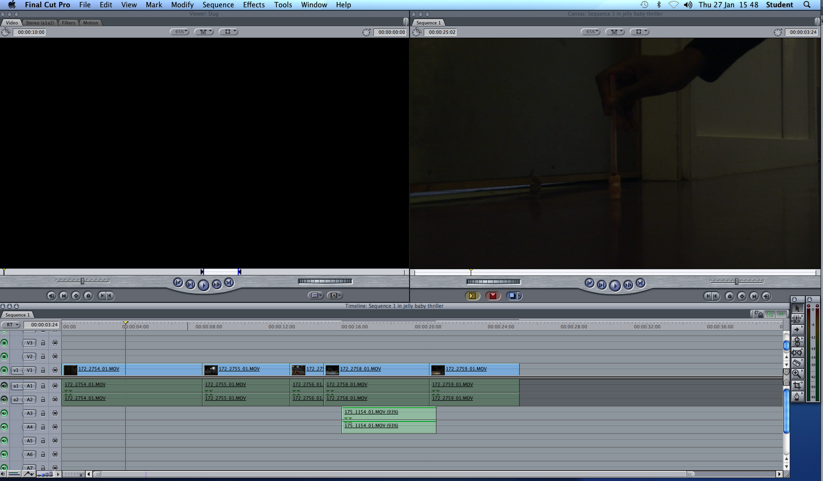
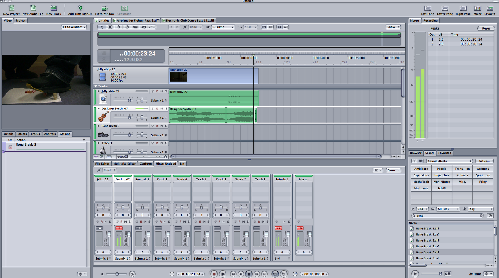
  This was the software we used to edit our scenes (Final Cut Pro)

Here is our 26 second planning using jelly babies :]


Thriller Audiences: RESEARCH

Below is an image showing which film genres appeal to certain genders


There are different types of thrillers, from psychological to supernatural thrillers which appeal to different people.
Action thrillers - MALE
Supernatural thrillers - FEMALES
Political thrillers - MALE
Detective thrillers - BOTH however they appeal slightly more to FEMALES

1. How many suspense films were released in 2009? How many films were released altogether last year?
Only 31 suspense films were released in 2009, altogether 503 films were released in 2009.
2. Action, animation and comedy account for 52% of Box Office in the UK in 2009. Why do you think these genres are so popular?
I think these genres are more popular because, not a lot of technology is required compared to something such as horror which is not found a lot in UK films. Furthermore cinema goers tend to be young people and these genres appeal to them.
3.Why do you think Thrillers account for quite a low proprotion of UK Box Office takings (4% in 2009)?
Thrillers tend to have a higher age certificate so some young people and children cannot view it, which has a big effect because they are the main people who go the cinema
4.Looking at the 'genre by gender' diagram above, what information can be derived about Thriller audiences and gender?
Thriller that is to do with action, or has elements of sci-fi are favoured more by men because it is more tense and requires a lot of pace. Females on the other hand prefer romance and although there are not much 'romantic thrillers' they tend to prefer suspense, psychological and passionate murders because, they tend to have an element of lust or romance.
5.Look at the age certificate for 10 of the films featured on the teaching blog. What does this tell you about Thriller audiences?

This tells us that thriller films are only suitable for people aged 15 and over. This may have an impact on the genre gross in the UK because, most people who go to the cinemas are also under 15. An example of how the age certificate has an impact on the genre gross is the gross in 2009 which was £42, 578, 104 compared to comedy which was £219, 228, 278

'Watching' Documentary on Film Openings: RESEARCH

1. Thomas Sutcliffe says 'Films need to seduce their audience into long term commitment. While there are many types of seduction, the temptation to go for instant arousal is almost irresistable'. What he means by this is that you should slowly lure into a film and not jam punch peopel straight away. He believes that films need to 'make' you want to watch it and, he compares this to sexual seduction which is metaphorical for this.

2. Director Jean Jacques Beineix, argues that there is a risk of 'instant arousal' this is because if you start a film so strong you have the question of what to do next.

3. 'A good beginning must make the audience feel like it does not know nearly enough yet, and at the same time make sure that it doesn't know too little' this is so that something gives them reason to watch it yet not over doing it, because they may think it is a cliche. A film that does this greatly is The Stepfather it starts out very ordinary of a man getting ready for what we think is a normal day however, we see a dead child on the breakfast table which makes us think 'hold on soemthing is not right' giving us reason to watch more.

4. Stanley Kauffmann describes the classic opening, as an establishing shot of a New York building, thena close up of a window then, the receptionist office and the camera works its way into an office where we meet our first key character and that is usually where the first dialogue starts. This type of opening anticipates me to watch more because I personalyl think, 'A film cannot be so normal, what is his/her secret' and makes me want to watch more.

5. Kyle Cooper's title sequence of the film Seven is so effective because, it foreshadows what would happen and shows short characteristics of the film.

6. Orson Welles wanted the audience to automatically be plunged into his film so instead of putting the theme tune of Universal Studios whilst there logo was up he, added another sound track which caused an argument which he eventually won. Thr production company even wanted to put titles on it which he was angry about because he did not want that either.

7. There is a saying 'A favourite trick of Film Noir' the trick is that we see what we think is the end of the film in the beginning.

8. The film The Shining creates suspense in the opening title sequence because, there is a shot of a helicopter chasing a car which tells us that the person/people in the car is someones prey. Furhtermore the fact that they are the only car driving in an unknown country area the audience feel like they are going the wrong direction, 'ommens' and it is a no way out. 

Lurpak Sequence - THRILLING OMLETTE

In class we watched an advert of a omelette being made. The aim of this advert was to sell Lurpak which is the brand of butter. The idea of someone making an omelette sounds very boring however, it was turned into an advert so suspenseful and 'wierdly' kept me on edge to see whether it would fail or cook perfectly. During the first 9 seconds of the advert the lighting is very dark so the audience are wondering what the advert is about which immediately keeps us hooked. The backing track of the advert was quiet slow yet suspenseful and it almost sounds like a church choir, however there were a lot of bangs such as the opening of the fridge. The voice over in the advert is of a man with a very deep yet low voice which creates a lot of suspense and makes the audience want to listen to what he is saying, which is important because he is the narrator. What I really enjoyed about this was that there were a lot of close ups on the littlest things that we do not really pay attention to when we are cooking such as bread crumbs. There was even a bit of irony when the egg was being cracked because there is a high angle shot, which is quiet close up of the cracked bowl and I found it funny as the egg was about to be cracked. After however, when the egg is being mixed the camera zooms out and we no longer notice the bowl is cracked. I really liked this because, it has shown me that something so simple could be turned into something very interesting and suspenseful, and it has inspired me with an idea for our thriller piece to do something simple but turn it into something very suspenseful rather than sticking to something cliche.


Art of the title sequence

This is England

This Is England contact sheet

The font of the title 'This is England' is in a 'smudged' yet small font as a matter of fact all the titles are like this. The actual title of the film is placed over a wide shot of flats in England, I like this because it immediately tells the audience that the film is going to be based on the working class areas of England. From the look of the images I can see that this film is set in the 80's. The names of the producers and important people seem to be in a bigger font size than the title of their role in the film. This makes the audience aware of who they are and acknowledge them more. This title sequence mainly consists of mid-shots, close ups and wide shots. The mid-shots are mainly the group of people for example in the second box on the top row we see three men whereas, in the second row on the first box we have a close up of a man and woman making out, this may also suggest that they are being pointed out because in the 80's it was not socially desired especially because they look young, compared to the last box on the third row which is of two very formal people telling the audience that there may be conflict within this film. I like this sequence because, it looks very realistic which is something that British films are known for.

The Structure of Thriller Openings with examples: RESEARCH

When looking at film openings we notice three basic structures which are as followed:

- A narrative opening with titles running throughout
Examples: The Stepfather, The shining
-A discrete title sequence
Examples: Seven, Arlington Road
-Titles over a blank screen, followed by the narrative opening
Examples: Donnie Darko and Mezrine

Inspiring font titles


A font used in a film that really attracts me is Orphan. 
The font type is a Sans Serif font and, we know this because it is very informal. I have already seen the film and I must say it is quiet chilling and has the audience on edge. 


The font itself is in the colour red which is not used often because, some find it 'offensive' as it connotes blood. However it is used effectively in this film because, although it is not fully gory or bloody the red connotes anger, jealousy, hate and warning because, red is generally used to alert people. What I also like about this font is the way the letters are spelt, the correct way of spelling it is 'Orphan' rather than 'OrPHAN' this tells the audience that is in the handwriting of a child who may be an important character in the film hence there is a child on the front cover of the blu-ray. 
Furthermore the font seems to be written very harshly to emphasise their anger and the fact that they are an orphan. The informality of the text can symbolise the characters status as some people may refer to orphans as being quiet poor and less educated than others. 

Font Analysis: RESEARCH


There are two types of fonts, Serif fonts and San Serif fonts. 

Serif Fonts - Such as Times and Georgia and Courier 
Serif fonts are generally more traditional and much more formal than San Serif fonts. A Serif is the extra detail at the end of each stroke of every letter. 


Sans Serif Fonts - Such as Arial and Comic Sans
San Serif fonts are usually much more informal, more modern and more 'friendly'

Font Analysis

 The font used on the cover of Pearl Harbour is Palatino. The title is in capital letters, Serif font and in bold. The characters on the DVD cover are in very formal clothes and the gesture done by the woman in the middle states importance and the idea of formality which, the font itself connotes as Serif is very formal and the idea of it being in bold and capitals states importance. Furthermore the text itself is very 'tall' and 'lengthy' this is an old fashioned thing to do in films which tells us that the film may be something to do with the past, also the idea of the letters being tall links to the plane as they are both very high. I personally do not like this font very much however, I think it tells us a little about the film.


The font used in the film Rocky is Franklin Gothic Heavy. The title is San Serif, in capital letters, big and bold. The idea of it being big and bold reflects the film as it is to do with boxing, the font seems to remind me of a big thud and it is squashed into the cover which somehow reminds me of a punch as someones fist is being squashed into your face. The font is not fancy or very detailed which tells us it is quiet informal, and it is quiet modern.

Friday 28 January 2011

Practice Film 1: Screen grabs

This is the toolbar we used to find our sound effects , backing tracks etc
Here we are using Sound for effects for our clip which is on the left of the screen. The bars with green highlights the loops of the effects

Livetype and Sound: SKILLS

Livetype

After we learnt how to used Final Cut Pro we were introduced to Livetype which is a program we will use for creating our title sequence. This program has many features such as creating titles writing on our film with different animations, fades, different font types, colours etc. We were given a short time to play around with the software although I learnt how to create a title position to how I want and change the font colour. I done an example and used the text 'Your Highness' at first it was in a normal font however I changed the font to something 'girly' added pink and positioned it according to my preference. 

Sound

We then used the Sound program which allowed us to add sound effects, accents and motifs. I found that there were plenty of sounds to choose from hand claps, laughters, chilling musical refrains and a variety of genre to choose from. The aim of using this program was to give us some knowledge for when we use it for our final thriller opening. After we experimented the software individually we got together as a group and chose a backing track for our bag swap task. In the end we used a beat from the beginning to the end of the clip which was full of action, tension and pace. Considering our bag swap including plenty of running and moving about this backing track suited our clip. Below is a screen shot of the sounds being applied to clip. 


Introduction to editing: SKILLS

Within lesson we were introduced to editing using a program called Final Cut Pro, which is a program used to edit videos and clips. 


This program enabled us to cut scenes we did not need through the 'in' and 'out' button which allowed us to use the footage we did need and dispose the ones we did not. We had to include a total of 12 shots within our 'bag swap' task, however we done more which allowed us to have a larger variety of footage that worked best. The program had features on it such as fade ins, and fade outs, however we did not use them for our final clip because it was not necessary however, we did play around with it.


The program also enabled us to crop footage we did not need however this meant that the footage that was left was in large pixels which was not, effective in our bag swap scene which is posted below.


Thursday 27 January 2011

Preliminary exercise- Planning

As a preliminiary match cut exericse, we were given a brief which was to film the following sequence..Making sure to use at least one match cut, an example of shot/reverse shot and showing your understanding of the 180 degree rule.

This is where we had to plan our Prelim exercise to practice using Jelly babies. We had four main jelly babies that represented us as actors. We had a basic outline of a story line and  planned it out as a group. Our ideas came naturally and we were able to incorporate everyone's ideas effectively. We added suspenseful music from Sound Track Pro to just create more suspense and included one line of dialogue. We decided to do this as it was much more suspenseful is there wasn't a huge conversation in the scene.

                  ^My group filming our brief plan using jelly babies^

Take a quick look at our 26 second planning using Jelly babies!
Yellow (Demi)
Black (Elias)
Yellow covered in blood (Mariama
Orange (Sheri)

Livetype and Sound Skills

We learnt to use the 'Livetype' and 'Sound'. Firstly I started to practise using these systems to learn the main functions and purposes that will be essential in the making of our actual real thriller opening. First I used the 'Livetype' program practice how to use lettering to make an effective font for my thriller film opening credits. There were many different fonts to choose from with many effects and animation such as playing cards, flowers, dissolves and fades. It was a good way to experiment with font types and the way in which you can move letters about to form different shapes and styles of words. It makes your work look more creative and exciting especially for thriller films.

Afterwards I was introduced to the 'Sound' called Sound Track Pro, this is where we created the background music for the bag swap that we produced. I was practicing with different sounds and just listened to lots of beats, instrumentals and voice notes. Then i started to look for sounds that were full of tension and also suspenseful. It was very difficult to choose form so many sounds so it took quite a lot of time to go through as many as i could in the limited amount of time. I had to find the right sounds that fitted together to form a good suspenseful sound.

After this, my whole group to start editing the Bag Swap short film that we created. First we added the bag swap video to the 'Sound track pro application' system. It opened in a small screen on the programme so we could put the music  in sync with the film.

Here is where the toolbar to choose which type of sound we wanted in the opening. We choose some gun shot sounds with fast beating background to emphasise when i was running in the bag swap scene.------>

Wednesday 26 January 2011

The Structure of Thriller Openings

There are three types of basic structures that are followed:

  • a narrative opening with the titles running throughout
 e.g The Shining and The Stepfather

  • a discrete title sequence 
e.g. Se7en and Arlington Road

  • titles over a blank screen, followed by the narrative opening
e.g Donnie Darko and Mesrine


Font Analysis

There are two types of fonts: 


Serif fonts - fonts that have 'flicks' on them. i.e - times new roman - serif is the little extra strokes at the end of every letter
these types of fonts are more traditional and formal


Sans serif fonts - fonts that don't have the 'flick' i.e - arial - sans means without - ''without flick'' fonts.
these fonts are more informal, 'friendly' and modern.


FONT ANALYSIS - PEARL HARBOR


  • PALATINO font was used
  • bold, capital letters make it stand out
  • serif font - formal, old fashioned font - connotes history
  • ''tall letters'' - regimental
  • capital letters = army


FONT ANALYSIS - ROCKY


  • Franklin Gothic Heavy font was used
  • big, bold, broad
  • sans serif font
  • punches out
  • informal - plain but concise
  • simple font = simple guy