Serif Fonts- Such as Times and Courier
Serif fonts are generally more traditional and often slightly more formal than sans serif fonts. (A serif is the extra little detail at the end of each stoke of every letter)
Sans Serif Fonts-such as Ariel and Comic Sans
Sans serif fonts are generally more informal, more modern and more 'friendly'
Font Analysis-
What does the font PALATINO suggest as used in the promotion of PEARL HARBOUR? It shows thta it is quiet formal and important as it stands rather tall (letters). It is in the middle of the poster and all in capital letters so it stands out more clearly. Serif seems to connote old style font for a historical movie.

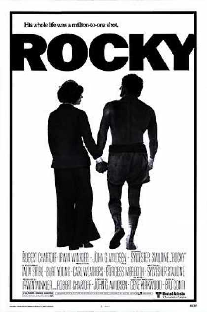
Rocky used the font Franklin Gothic Heavy. The font was chosen in this way because it was bold and big. In some way very broad. The Sans Serif is much less formal and more entertaining. The character Rocky is simple ordinary character so its reflects his persona. The Title looks as if it is punching through the poster as it can barely fit. This further reflects the name.

No comments:
Post a Comment